I incorporated a classic blue and soft pink color palette into the hotel stationery to enhance the whimsical yet sophisticated essence of Hotel Chelsea. The classic blue evokes nostalgia and timeless elegance, while the soft pink adds warmth and playfulness. To further elevate the design, I integrated duotone illustrations, bringing a dreamlike quality to the stationery. These elements work together to create a visually enchanting experience, reinforcing the hotel's storybook charm & branding.
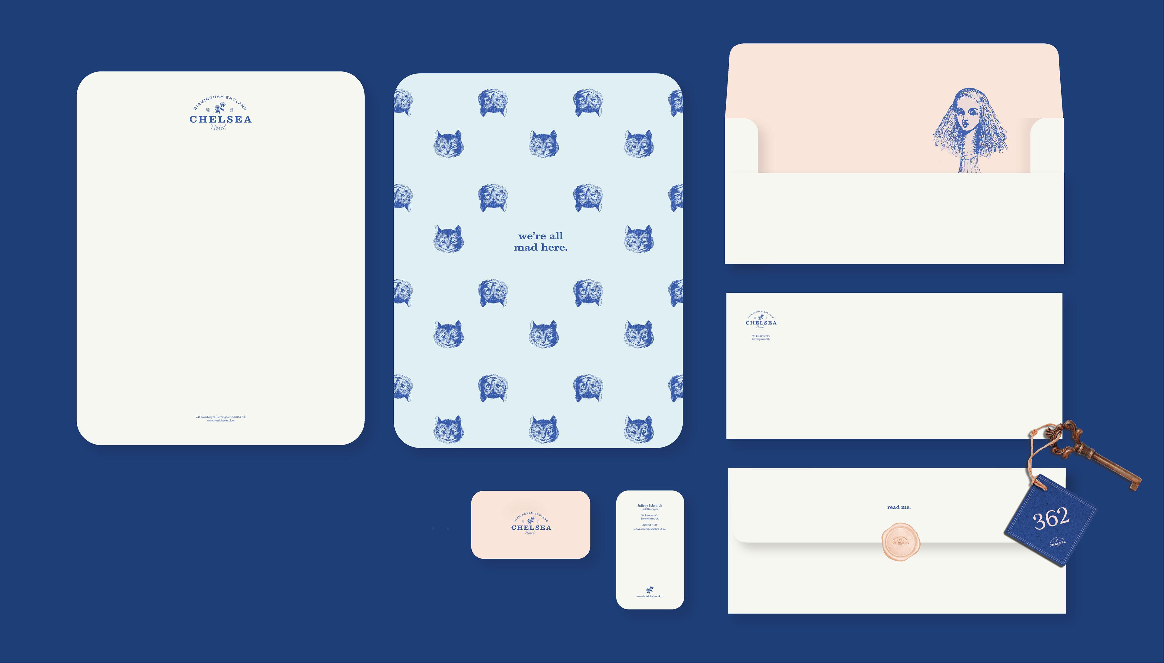

I also utilized mushroom illustrations into a custom pattern for the hotel packaging, highlighting the psychedelic and natural themes woven throughout Alice in Wonderland. The mushrooms, a nod to the story’s sense of curiosity and transformation, add an organic yet surreal touch to the design. This pattern subtly reinforces the hotel's enchanting atmosphere, blending whimsy with a hint of the unexpected.