Bari App features a calming and motivating color scheme with lavender, blue, and lime green accents, complemented by white and purple as primary colors. These colors were carefully chosen to evoke a sense of calmness, health, positivity, and motivation—key elements for users undergoing a transformative lifestyle change.

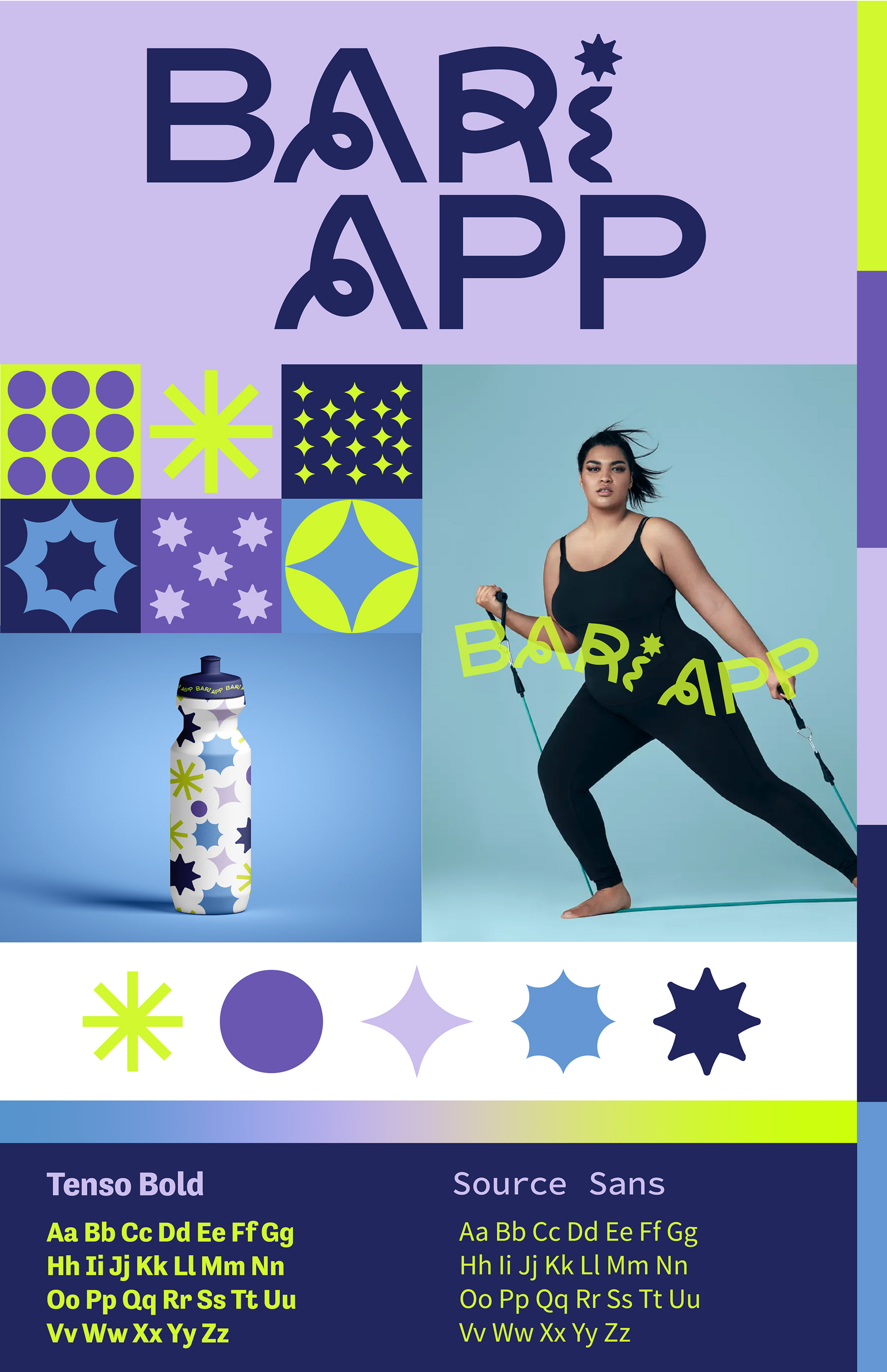
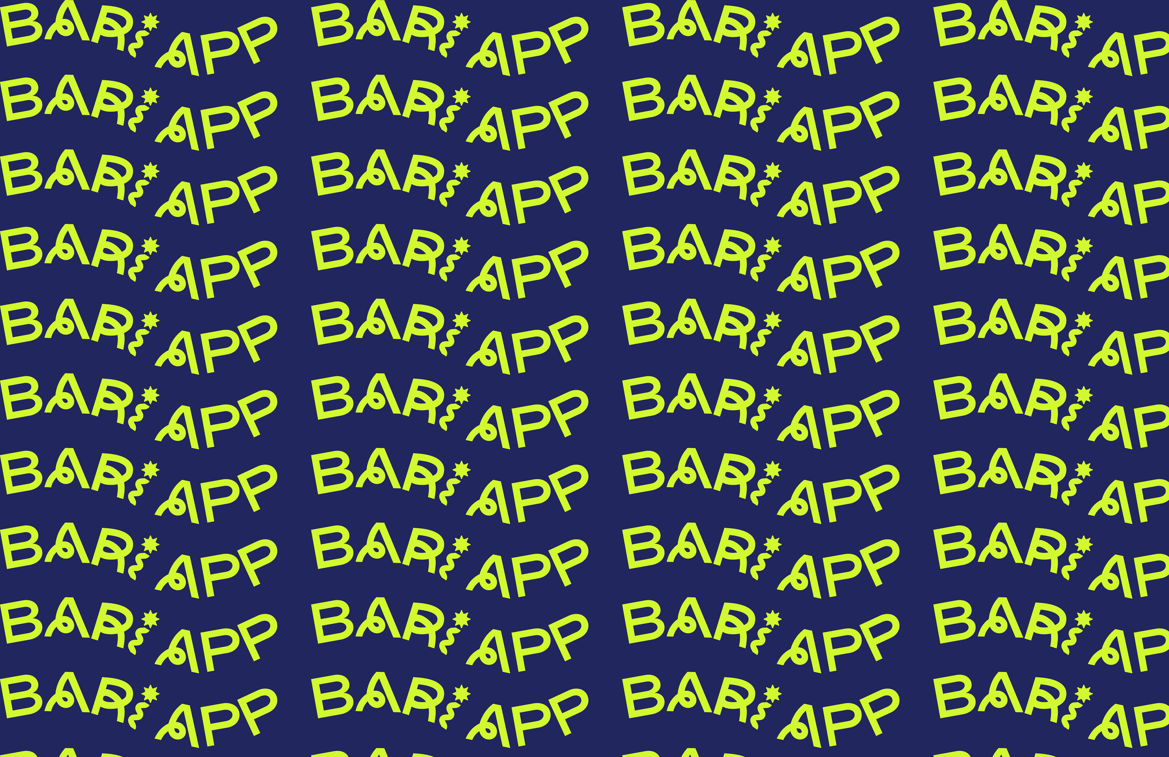
I designed custom patterns that evoke movement and positivity, reinforcing the app’s focus on wellness and progress.
The dynamic shapes and fluid compositions create a sense of forward momentum, while the uplifting color palette enhances motivation & encouragement throughout the user experience.
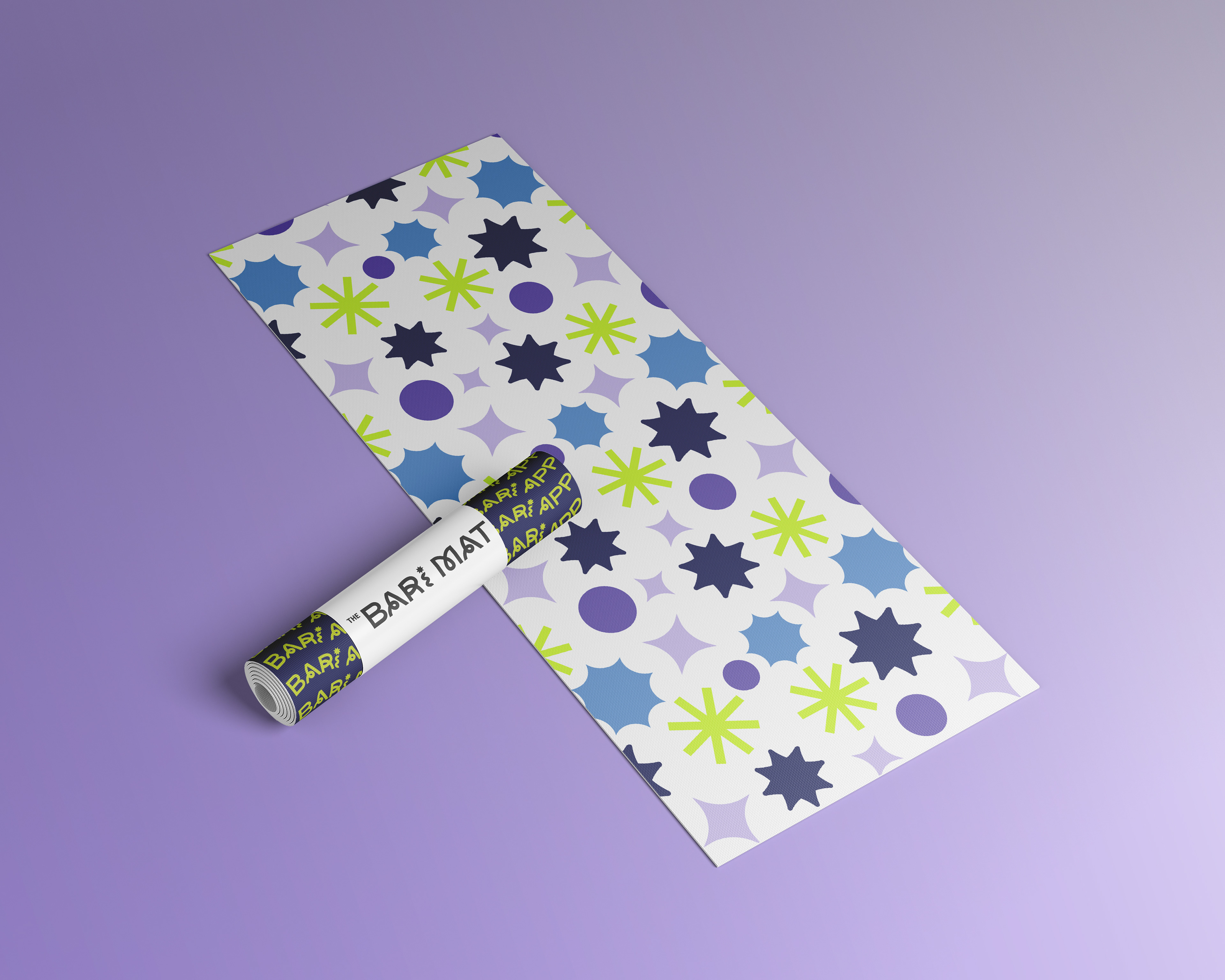
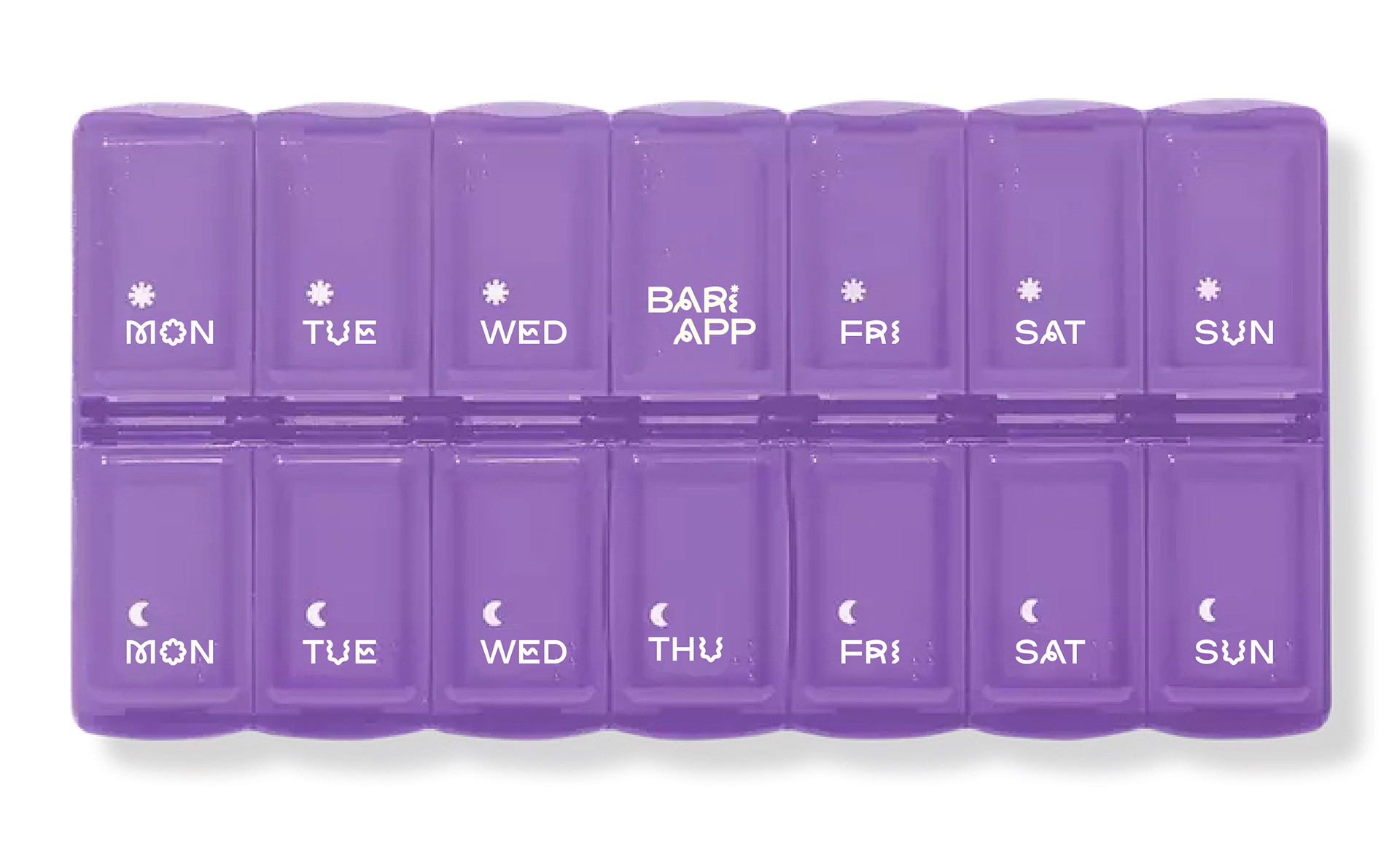
Double Sided Yoga Mat | Vitamin Organization
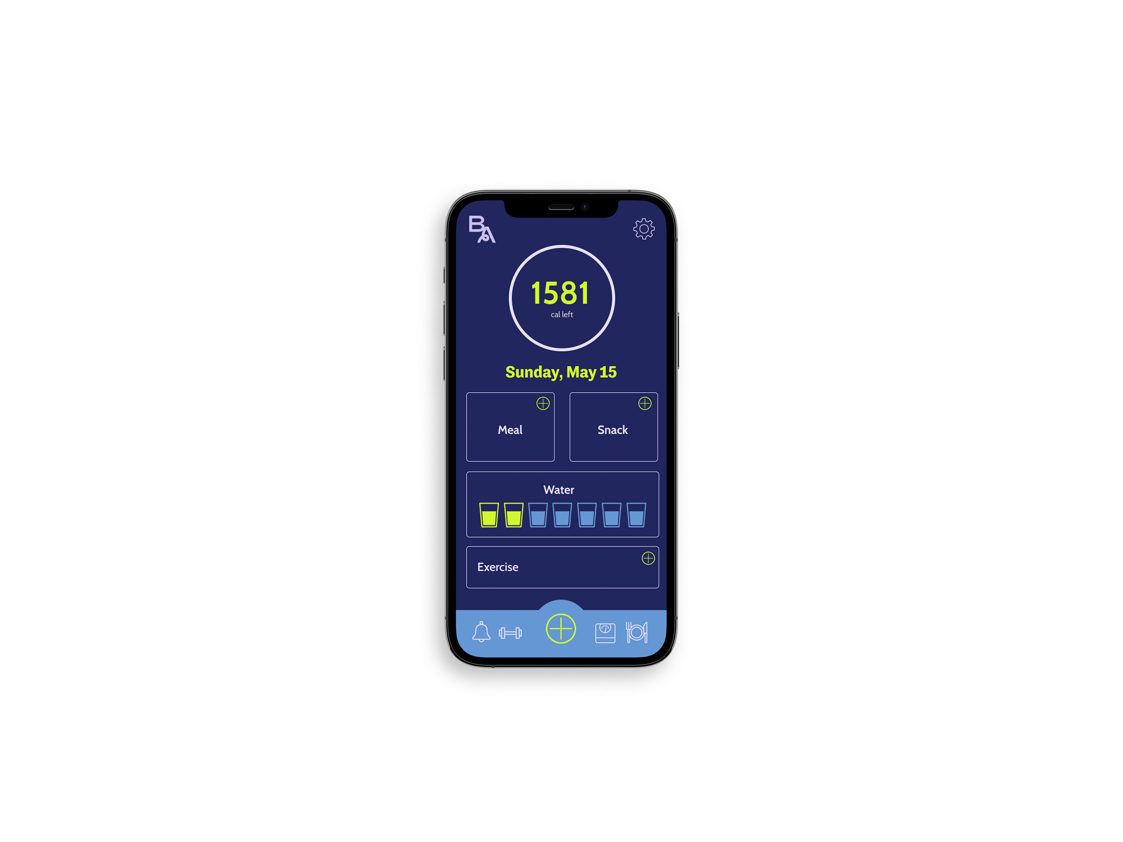
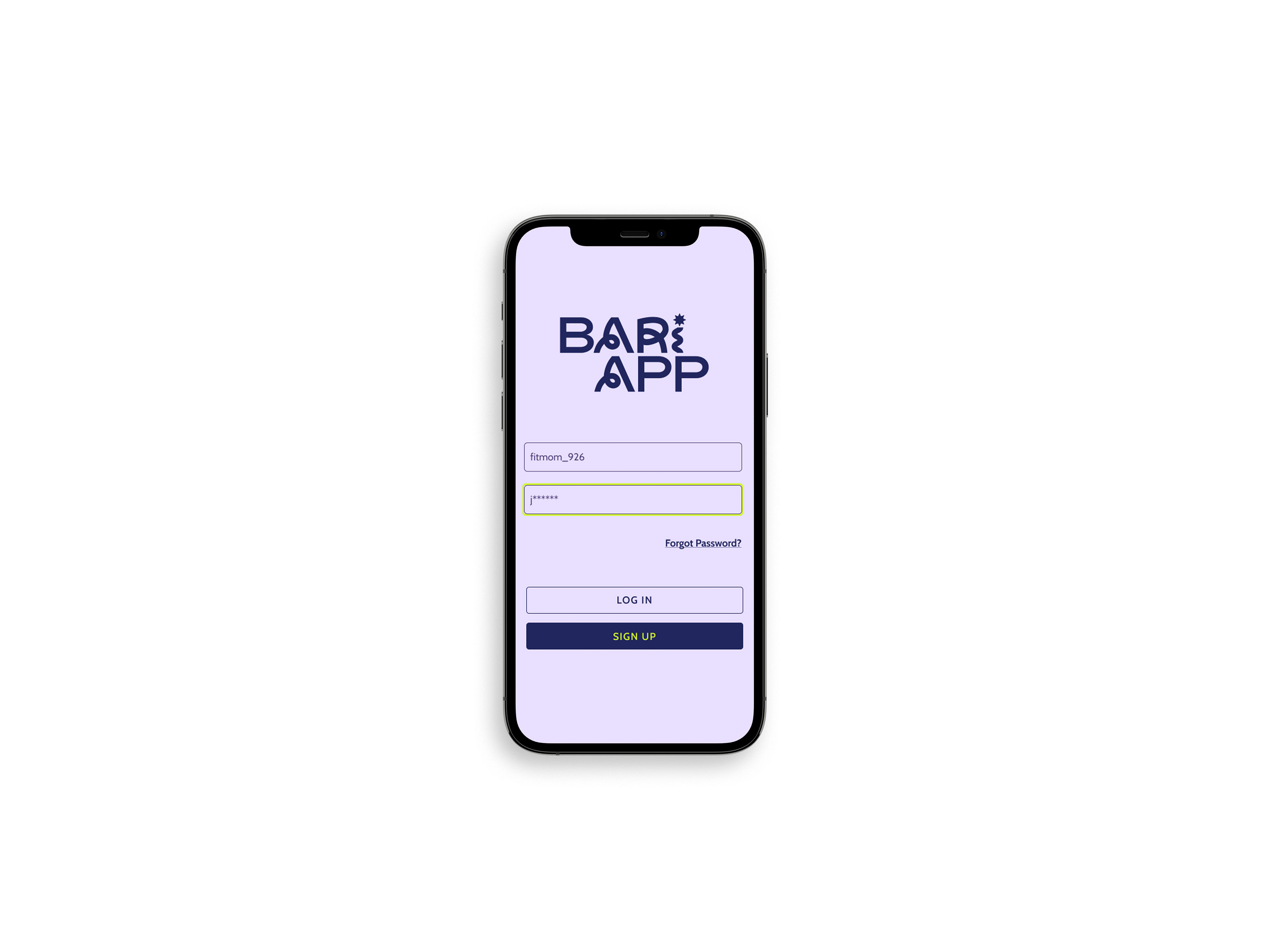
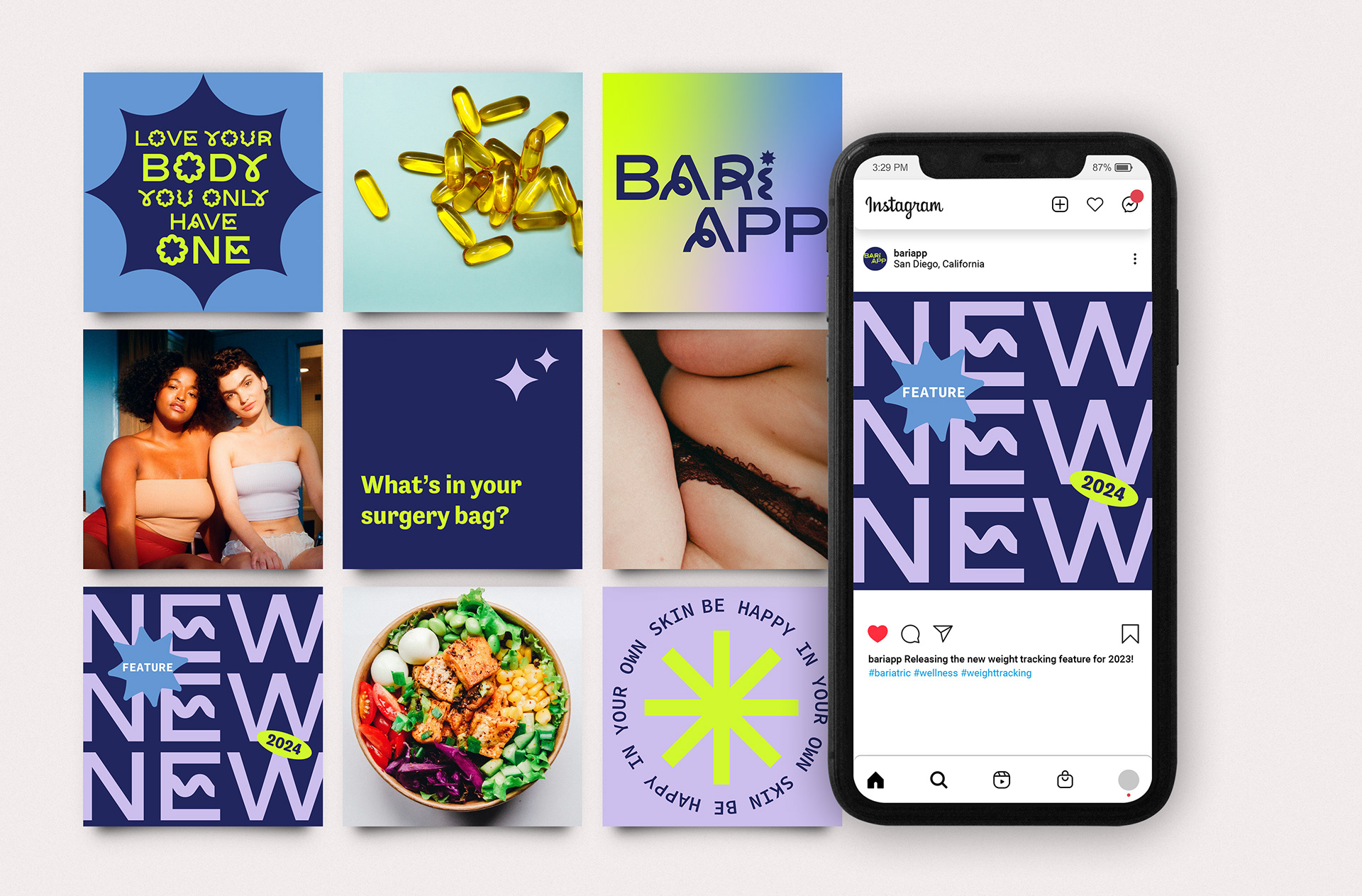
Mobile Click-Through
Created in Figma, Custom Pattern